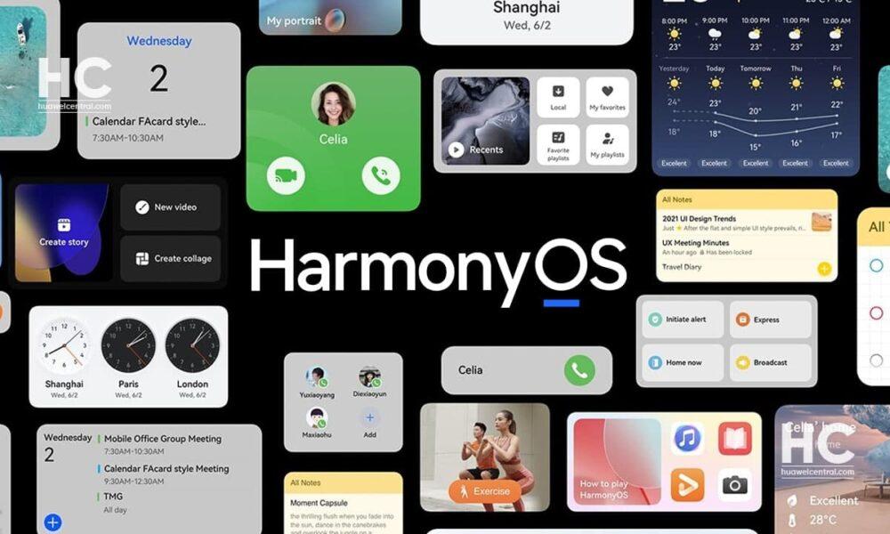
In the ever-evolving world of mobile operating systems, iOS vs HyperOS have gained popularity for their unique features in interface and most popular interfaces because of selling numbers. Let’s delve into the comparison of these two systems to review the similarities and differences they exhibit. The main reason why iOS and HyperOS are so similar is the struggle of Xiaomi trying to replace Apple in China. HyperOS is very similar to iOS so that users who want to switch from Apple to Xiaomi devices do not have a different feeling.
Table of Contents
Control Center
Starting with the Control Center, it is not possible to understand which is iOS and which is HyperOS. However, when we look carefully, there are more rounded shortcuts design is exist in HyperOS. HyperOS and iOS both have a music player tile. The tile colors in HyperOS and iOS are the same, blue. When we make an overview, the iOS control panel and the HyperOS control panel are almost the same.
Lockscreen Customization
If we check the lock screen customizations, with HyperOS, Xiaomi devices have added lock screen customization options that are very similar to iOS. There are more customization features than the customization features available in iOS. Switching between saved lock screens is possible with left and right gestures in iOS, while in HyperOS it is enough to move up and down.
The feature of adding widgets to the lock screen has been expanded in HyperOS. While you can place a single widget under the clock on iOS, you can place 3 widgets under the clock on HyperOS. We can also write any text we want instead of the date. Additionally, it is possible to add various effects to the lock screen wallpaper, such as blur effect and carousel effects.
Settings
Settings menu, both operating systems share some striking similarities. The placement of the “Settings” label and the information about the user account is identical. While the original Android has a profile picture to the right of the “Settings” text, Xiaomi has embraced a similar style to iOS, incorporating a profile picture on the right. Moreover, the background colors of the settings menu icons are an exact match with iOS.
Dialer
When comparing the dialer applications, HyperOS stands out with a more user-friendly design. While iOS features a keypad only, Xiaomi adds recent calls above the keypad. Looking at the bottom bar, both systems have similar menu buttons, resembling the iOS layout. However, apart from the icons in the bottom bar, there is little similarity in the call screen between HyperOS and iOS.
Contacts
In the Contacts application, the similarity is more apparent, especially in the “My Profile” section. If our photo were visible in the “My Profile” section, the Contacts app on HyperOS would be nearly identical to iOS. The alphabetical listing format and the positioning of the “Contacts” label contribute to an iOS-like feel.
Photos
The Gallery application on both systems appears almost identical, with matching bottom bar icons. The key difference lies in the arrangement of recent photos; iOS places them at the bottom, while HyperOS positions them at the top. The latter choice may provide a more intuitive user experience.
Alarm
In the Alarm application, there is little resemblance between the two. iOS boasts an orange-themed interface with more comprehensive options, while HyperOS opts for simplicity. HyperOS displays the time remaining until the alarm, whereas iOS conveniently shows the morning alarm at the top of the screen.
Calculator
When we compare the Calculator application, both are calculator application that is different in design but the same in positioning. In HyperOS, you can additionally use the currency converter feature by switching between tabs. It is also possible to use the calculator application as a pop-up using the picture in picture feature by pressing the button on the top left. When we turn the screen sideways, advanced features are opened on both calculators.
Calendar
The Calendar applications on HyperOS and iOS are vastly different. HyperOS displays only a monthly calendar with details squeezed onto the screen, while iOS allows users to scroll through the entire calendar. If there is an event, a red circle appears below the respective day in iOS.
Compass
The Compass applications diverge significantly. HyperOS provides additional features such as altitude and air pressure, whereas iOS focuses on coordinates and compass direction. HyperOS’s compass application proves to be more functional.
Battery
When we compare the battery information screen, we see a completely different interface. HyperOS has a huge battery remaining panel top of the screen. In iOS, battery percentage and battery saving options are at the top of the panel. More battery saving options are available in HyperOS. We can also adjust performance settings from here. At the bottom of the screen, battery level history and screen usage time are exist on both devices. Additionally, iOS has an activity tracking feature. This is located in another menu in HyperOS.
About Phone
In the “About Phone” section, HyperOS provides a simple summary, while iOS offers comprehensive details. To access the same information on HyperOS, entering to an additional menu is required. However, the “About Phone” section on HyperOS is aesthetically pleasing.
Weather
The Weather applications share a common point with a moving sky background. At the top of both interfaces, “high,” “low,” and “current temperature” are visible, along with the location. iOS additionally displays hourly weather information, a feature absent in HyperOS.
In conclusion, while iOS and HyperOS share some visual similarities, they differ significantly in terms of functionality and design in various applications. Each operating system offers a unique user experience, catering to the preferences of their respective user bases.


